Listen to this episode of the Crazy Joe’s Drapery and Blinds podcast on Spotify, Apple Podcasts, and Amazon Music. Free in-home consultations across Toronto and the GTA — call (905) 848-2181.
What colour blinds go with grey walls, white walls, and dark walls — let's actually answer this specifically instead of giving you vague guidance. Colour decisions for window treatments are something people agonize over, and they don't need to. There are clear principles and clear answers for each wall colour scenario.
First — a principle that makes everything easier. Your window treatment colour should either blend with the wall — creating a calm, unified look — or contrast with the wall — creating a deliberate, designed statement. What doesn't work is an accidental in-between — a colour that's trying to match the wall but failing, or a colour that stands out without being intentionally bold. Commit to one direction or the other and the decision becomes straightforward.
Grey walls — the most common wall colour in Toronto homes right now. Grey is a chameleon — it can read as warm or cool depending on its undertones, and your blind colour needs to align with those undertones. First step — determine whether your grey has warm or cool undertones. Hold a pure white piece of paper next to the wall. If the grey looks slightly green, purple, or blue by comparison, it has cool undertones. If it looks slightly yellow, pink, or brown, it has warm undertones. Cool grey walls — go with cool white or off-white blinds. A warm cream on a cool grey will look yellowed and jarring. Pure white works. A cool light grey blind blends beautifully. For something more interesting, a soft blue-grey or a dusty blue creates a tonal look that's very sophisticated. Warm grey walls — go with cream, linen, or warm off-white. Pure bright white can look harsh against warm grey. A warm neutral blind reads as harmonious. For contrast on any grey — a deep charcoal blind creates a tone-on-tone statement. Or go the other direction with something light and fresh. What to avoid — muddy mid-tones that neither match nor contrast.
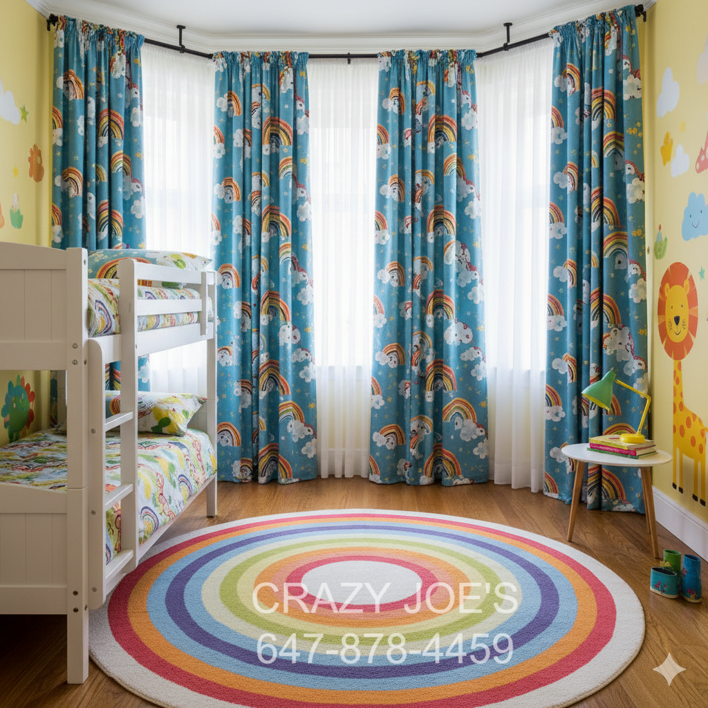
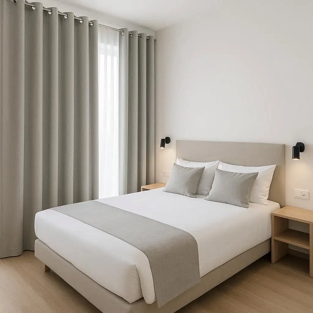
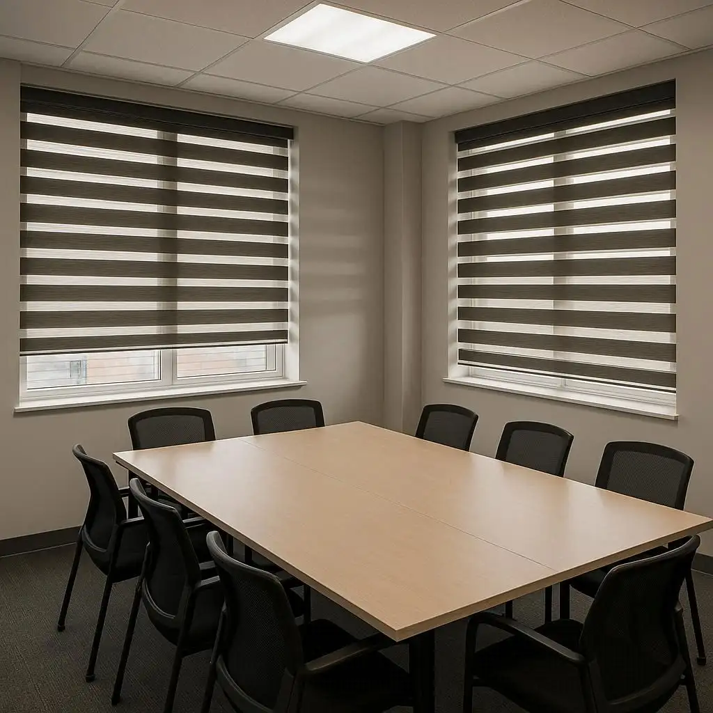
White walls — maximum flexibility. White walls are the most forgiving backdrop for window treatments because white recedes and lets anything in front of it be the star. White or off-white blinds on white walls — the classic minimal approach. The blind disappears into the wall and the window reads as clean and open. This works well in small spaces and in very modern interiors where you want a seamless look. Natural tones on white walls — a warm linen, a woven grass shade, a warm camel roller blind — these bring warmth to a white room without introducing too much visual complexity. The contrast is warm and natural rather than stark. Bold colour on white walls — this is where white walls really excel as a backdrop. A deep forest green blind, a terracotta shade, a navy roller blind — all of these make a striking statement against white and look very intentional. The white wall makes the colour pop without competition. For drapes on white walls — this is where you have the most creative latitude of any wall colour scenario. Almost any colour works. Trust your instinct about what would make the room feel the way you want it to feel.
Dark walls — this is where people get most nervous and where the most interesting choices live. Dark walls — charcoal, deep navy, forest green, almost-black — are increasingly popular in Toronto homes and they look stunning with the right window treatment. The two approaches that work on dark walls. First — match closely. A blind in a similar dark tone to the wall creates a rich, enveloping effect. The window becomes part of the dark envelope of the room rather than a break in it. This is a sophisticated, intentional look. Second — contrast strongly. A bright white or very light blind against a dark wall is a bold graphic statement. The contrast is deliberate and architectural. It works particularly well in rooms with strong natural light where the white blind becomes a luminous element against the dark surrounding. What doesn't work on dark walls — a mid-tone blind that's lighter than the wall but not white. Something that's trying to be neutral on a dark wall just looks washed out and indecisive. Go dark or go light. For drapes on dark walls — a lighter drape softens the drama and balances the room. A white or cream linen drape against a dark green or charcoal wall is a combination that interior designers use constantly and for good reason — it's stunning.
Testing before committing. Never choose a blind colour based on a small sample alone, especially when you have a strong wall colour to contend with. We bring large samples to homes during consultations. Seeing a full-width sample of a blind fabric held against your actual wall in your actual light takes the guesswork out completely. A colour that looks one way in the showroom looks entirely different in your room's specific light quality, next to your specific wall colour, against your flooring. North-facing rooms — which get cooler, bluer light — make warm tones look less warm. South-facing rooms with warm afternoon sun make cool tones look warmer. This interplay of light and colour is something you can only fully assess in the actual space.
A word about sheen and texture. Colour isn't the only factor in how a blind looks on a wall. Sheen and texture matter too. A matte fabric absorbs light and looks softer and more casual. A fabric with any sheen — even a subtle one — catches light and looks more formal and polished. In a traditional or formal room, a slightly sheened fabric blind can look very elegant. In a casual, relaxed room, matte is more appropriate. Texture adds visual interest at any colour. A natural linen weave, a woven grass, a subtle herringbone — these make a blind more interesting than a flat solid fabric of the same colour and suit rooms where you want warmth and character.
Crazy Joe's Drapery and Blinds carries a wide range of colours, textures, and finishes across all our product lines. Come into the showroom, bring a paint chip from your wall colour if you have one, and we'll work through the colour decision with you properly. Or call us and we'll come to you with samples. That's the best way to get this right.
Crazy Joe’s Drapery and Blinds has been Ontario’s trusted window treatment specialist since 1965. We offer custom drapes, custom blinds, motorized blinds, plantation shutters, roller shades, and drapery hardware — all custom-made in our Toronto factory. Free in-home consultations and free measurements across Toronto, Mississauga, Brampton, North York, Etobicoke, Scarborough, Vaughan, Thornhill, Burlington, Hamilton, Oakville, Ajax, Oshawa, Woodbridge, and Aurora.
Visit crazyjoes.com/ or call (905) 848-2181 to book your free consultation today.